Instantly improve your avatar as a newcomer

Oh my, why oh why do I see three year old and older avatars that still look like they created their account yesterday?  I know it must be laziness or perhaps lack of computer skills, but getting a good looking avatar is pretty simple!

Here, I’ll not only give you a step by step, I’ll assume you’re running Firestorm and give you a step by step to switch off things and switch on things that will instantly improve your look.

Let’s start with that.

Firestorm settings

Head follows mouse

  1. Open Preferences via the main “Avatar” menu, or hit Ctrl-P.
  2. Go to the “Firestorm” tab.
  3. Select the “Avatar” tab.
  4. Set the two sliders at the top to zero by dragging them all the way to the left.  They are labeled “Vertical/Horizontal range that avatar’s head follows mouse”.

Selection Beam

This stops your arm waving wildly around when you select something.

  1. Open Preferences via the main “Avatar” menu, or hit Ctrl-P.
  2. Go to the “Firestorm” tab.
  3. Select the “Avatar” tab.
  4. Untick the “Enable selection beam” checkbox.

Animation Overrider (AO)

This is a bit complex, but follow along step by step if you don’t have an AO.  Although there are a lot of steps, the procedure is straightforward, and uses computer skills and SL skills that you should already by familiar with.

  1. Find a FREE AO on marketplace, we’ll use the Basically Girl AO as an example, and buy it for L$0.
  2. Go to a sandbox, for example, Skybeam, or somewhere you have rez rights.
  3. Open your inventory (Ctrl-I) and locate the object “AX-001 Basically Girl AO”, either via the “Recent” tab if you just bought it, or using the search bar at the top of your inventory window.
  4. Left click on the object in your inventory, and while holding the left mouse button, drag it onto the ground.
  5. Right click the object on the ground and “Open” it, and click the “Copy to inventory” button in the “Object Contents” window that opens.
  6. Close the “Object Contents” window.
  7. Delete the object on the ground with right click and “Delete” (or if you’re using pie menus, right click, “More >”, “Delete”).
  8. You should now have a folder in your inventory called “AX-001 Basically Girl AO” containing an object called “AX-001 Basically Girl AO (Oracul Animations HUD)”.
  9. Left click this object in your inventory, and while holding the left mouse button, drag it to the ground (be careful, the object is small).
  10. Right click the object on the ground and open it, and click the “Copy to inventory” button.
  11. Close the “Object Contents” window.
  12. Delete the object on the ground.
  13. You now should have a folder in your inventory called “AX-001 Basically Girl AO (Oracul Animations HUD)” containing lots of animations and three notecards called “SET01-” followed by a height in centimeters.
  14. If you don’t have a toolbar button labeled “AO” in your toolbar, create it by selecting “Toolbar Buttons” from the main “Avatar” menu, locating the “AO Animation Overrider” button, and dragging it to your toolbar.
  15. Click the AO button on your toolbar to open the “Animation Overrider” window.
  16. Choose one of the notecards, for example, “SET01-155cm” that is closest to your height.  If you don’t know your height, right click your avatar and select “Edit shape”.  The shape editor window will open and your height is in the top right corner.  You may have to click “Metres” to see the metric height.
  17. Left click your chosen notecard and holding the left mouse button down, drag it into the “Animation Overrider” window.
  18. Close the “Animation Overrider” window (and your inventory, you’re done with it) and tick the checkbox in the AO button on the toolbar.
  19. Congratulations!  You now have an AO.  You can disable or enable it with the checkbox on the toolbar button.
  20. You can find other AOs and repeat this procedure to create multiple AO sets in Firestorm.

There’s addition information about the in-built Firestorm AO on the wiki, including links to tutorial videos on how to set it up and customize it.

Fix Bento Idle Animation

Bento is cool, it allows us to move our fingers, and do a lot more facial expressions than before.  But if you don’t have something to play an animation on your Bento bones, some of the default positions can look… weird.  The most common newcomer look is splayed hands.  Do this to ensure that if you have no Bento animations playing, your hands (and face, etc) will run a low priority animation that will fix the weirdness.

  1. Open Preferences via the main “Avatar” menu, or hit Ctrl-P.
  2. Go to the “Firestorm” tab.
  3. Select the “Extras” tab.
  4. Tick the box labeled “Fix Bento Idle Animation”

Typing animation and sound

This should probably be the first thing on the list 🙂

  1. Open Preferences via the main “Avatar” menu, or hit Ctrl-P.
  2. Go to the “Chat” tab.
  3. Select the “Typing” tab.
  4. Untick the box labeled “Play typing animation when chatting”.
  5. Untick the box labeled “Hear typing sound when people type in nearby chat”.
  6. On the left hand panel, select “Sound & Media”.
  7. Select the “UI Sounds 2” tab.
  8. Untick the “Play this sound” checkbox next to “Typing a message”

Appearance

There are certain things, mostly very old objects, available at various freebie places around the grid.  Because they’re free, newcomers tend to snap them up, but to anyone with any time in SL, all they do is mark you as completely inexperienced (and oblivious to appearance).  Once you know what these things are, you can avoid them, or modify them to improve the look of your avatar.

Bling

Bling, which is a particle effect meant to represent sparkly things like jewelry (hence the name), was apparently huge… in 2007.  Today, most people avoid it.  My advice is to chuck things with bling.  If you really like the piece and want to keep it, and it has modify permissions, you can potentially get rid of the bling effect, but to do so requires some basic scripting knowledge.

For help, try going to somewhere like Builder’s Brewery and politely asking an experienced person to help you.  Just remember, the people that you ask may not know how, or may not have time to help.  Thank them and politely ask someone else.  Just don’t be a nuisance to people as they are trying to build.  If you can’t find someone to help you, stash the thing back in your inventory and try another day.

Full bright

Full bright is a texture property.  It’s like switching a backlight on behind a picture.  This is great for lighted signs and stuff, but it looks horrible in hair.  Before mesh hair came along, prim hair was all that was available.  To make it look “better”, some creators allow you to switch full bright on and off by clicking your hair.  If you have “glow in the dark” hair, look for this option, else look for another hairstyle.

There are tons of good mesh hairstyles available for FREE if you take the time to look around.

Avatar expression

Specifically, the HUD that makes you smile every couple of seconds.  I remember finding this as a newcomer and thinking, “Great, my expression won’t be static any more!”.  But, strangely, smiling every couple of seconds comes across to me now as… creepy.  If you must use an expression HUD, try AnyPose Expression HUD, which you can get for FREE.  You can trigger an expression manually, rather than smiling creepily every few seconds.  As a bonus, you get eye position control with this, which is a boon for posed photography.

Mesh eyes

Get some for FREE at Mayfly Mesh Eyes, you’ll be impressed by the difference they make.  Using them requires basic editing skills.

Eyelashes

If your avatar doesn’t have eyelashes, get some prim ones for FREE, for example, these free eyelashes.  Using them requires basic editing skills.

Nails

Back in the day, prim nails were the way to go until you could afford SLink hands, which were the hand replacement of choice until mesh bodies came along with in-built hands.  I still love my SLink hands and wear them every day although I have a Maitreya mesh body.

As the new default avatars still aren’t Bento enabled, you should still be able to find some on marketplace.  And yes, Bows and Butterflies have a number of prim nail sets available for L$1 each.  Again, using them requires basic editing skills.

Makeup

It’s easy to be a blonde in RL and a redhead in SL.  And it’s easy to use your normal makeup tones from RL and look dumb 🙂  If you’re a blonde in RL, and you decide to be a redhead in SL, take the time to research makeup tones that suit redheads, just like you would if you dyed your hair in RL.  For heaven’s sake, try not to wear bright red lipstick with ginger hair, OK?!

Shape

We tend to exaggerate body shapes in SL.  Everyone can be the perfect supermodel, or you can go the other way and exaggerate… other attributes.  You can see what I look like on every other post on this blog.  I’m not a total glamor, and I’m not totally exaggerated either.  Both extremes mark you either as someone in the fashion industry, or a total newcomer.   To look good, I highly recommend you go for a “girl next door” look, with nothing totally over the top (pardon the pun).  You can create your own shape, but you can also find good starter shapes on marketplace for little or no cost.

Before fitted mesh, we had standard sizing.  It’s still a good idea to stick close to one of the standard sizes, as you do tend to come across good clothing for those sizes occasionally.  So, a good starter shape is this one for FREE.  It’s modify so of course you can tweak the sliders to make it your own.

Physics

This is a system attachment that makes your breasts and butt react to gravity in appropriate ways.  Get the Firestorm Team’s Physics pack for free on the marketplace and play around with settings until you get something you like.  To do this, wear a physics attachment from the pack, and right click it in your inventory and edit it.  Then you can adjust the sliders to your liking.  Settings can differ markedly for system bodies and mesh bodies, and you should think about what you’re wearing too.  You don’t want bouncing boobies while you’re wearing a corset, for example, so you should create a few physics objects and wear the appropriate one for the occasion.

Skin

Try lots of demos (in private) while you save up your L$ to buy the best skin you can that has both system layers and at a minimum, Omega appliers for both body and head.  Seriously.

You may be really lucky and find one that has system layers and appliers for free, but it’s really rare.  I think I’ve found one in six years.

Mesh body

For FREE.  Yes, really!  You can get all the details over at Ryan’s blog post.  And now FabFree are maintaining a page listing the current free body and head giveaways around the grid.  So there’s no reason not to have a mesh body!

Clothing

Of course, there is a ton of free clothing available via various means on SL and the marketplace as this blog proves every day.  I’ve written an entire article about how to find free clothing before.  And while this blog today is mostly focused on fitted mesh clothing for the major bodies (because that’s what creators generally put out as group gifts), you can still find standard sizes as I mentioned.  Also, with the introduction of BoM, a lot of system layers have been resurrected, and lots of nice things can be found for FREE to improve your appearance.

Thanks

If you got this far, thanks for reading.  I really enjoyed writing this as it bought back fond memories of when I was first starting out, and the steps I took to gradually improve.  Here’s six years difference (note that full bright hair on the 2014 shot eeps!):
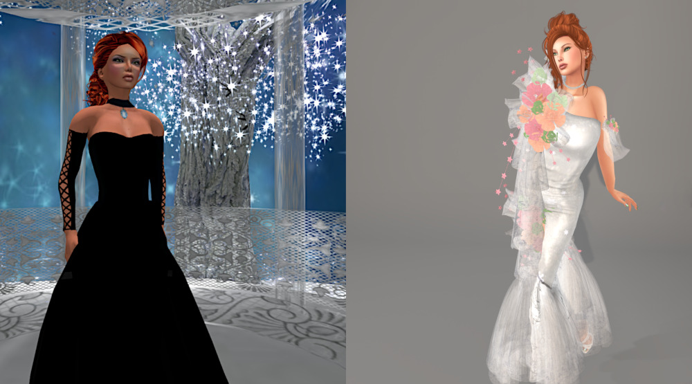
Blue – 2014 vs 2020


Getting started

Do you know we have an article to help newcomers get started in Second Life?  Well, we do!  It was this blog’s first published post.  Even though that’s quite some time ago, we still try and keep the article updated when things change.   To that end, I’ve just reviewed and made some minor revisions to it.

If you run into me in-world, I also have a version of the article as a notecard, so feel free to ask me for it.

Check out the article, and please pass it on to new people that could benefit from it.


Physics lesson

Warning, topless shots below the fold.

Let’s talk boobs.  I see a lot of female avatars getting it sooo wrong in SL.  In RL, we don’t have to worry, we have built-in shapes and physics, and our cleavage is controlled by the clothes we wear, not a texture, so we don’t usually have to think about it (with the exception of picking out that awesome pushup bra for a hot date lol)

In SL, none of this works automatically without some input from us.  We have shapes, physics layers, and skin options to worry about.

A decent quality skin is one of the things you should definitely splash out some money for.  You can get a reasonable skin for a couple hundred Linden Dollars, but a good one will probably set you back over L$800.  Believe me, it’s worth the time and money to find one that you like, as, along with your eyes, it’s the one thing you’ll wear all the time.

When it comes to selecting a skin, pick one with multiple cleavage options.  You want at least small for when you’re bare breasted, medium for when you’re wearing a bra or a bikini top, and “lots” for corsets and some formal gowns.  There’s nothing funnier than seeing an otherwise naked girl wearing a skin with lots of cleavage.  I keep having to ask myself “did she stick them together with superglue, or what?”  lol

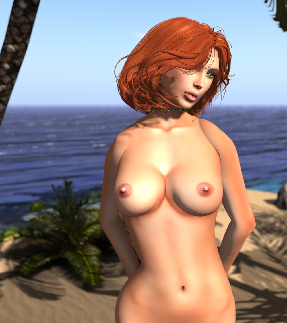
Do NOT look like this, there’s someone on that beach (like me) quietly laughing at you!

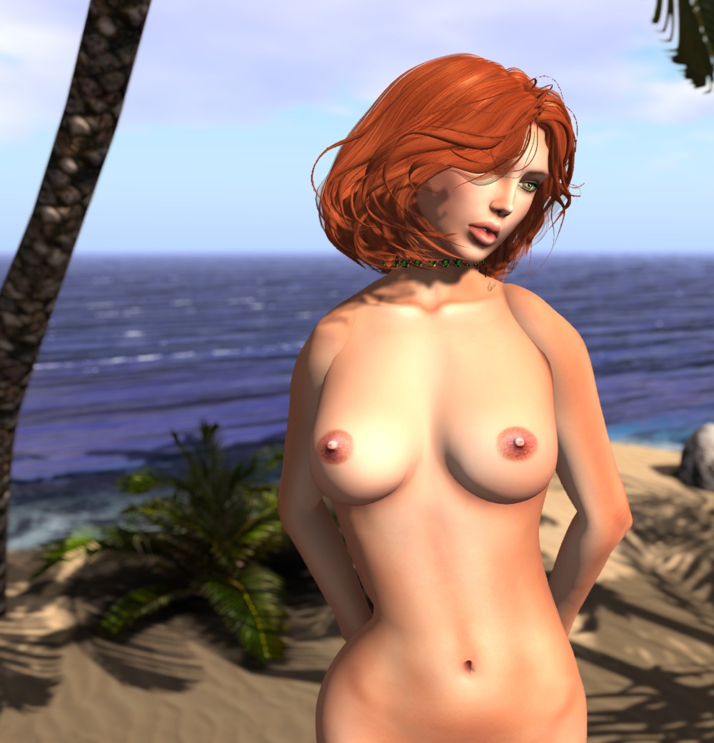
Much more natural looking 🙂

With Lara by Maitreya, there’s a great option in the HUD to store skins in save slots under the “Skins & Options” tab.  My skin (Adore Peach by Lumae) has four cleavage options, and all of those are stored in the HUD in Firestorm’s “Favorite Wearables” for easy switching without having to dig through my inventory.

Now, you all know we need support, and when that support is taken away, things tend to sag, much as we wish they didn’t 🙂  Before fitmesh clothing, we had standard sizes, and to fit them, many of us saved off a modified shape along with the clothes, and the most modified sliders, at least for me, were breast size and gravity.

Using the same principle, you should have at least a few variations on your base shape for the bare/bra/corset thing with various levels of gravity applied.

And also, when that support is taken away, things tend to jiggle.  This is where physics comes in.  Physics is a system layer that you wear.  Not only can it control breast physics, but also stomach and butt as well.  Basically, the settings tell the viewer how much things should jiggle and which way they should jiggle when you move.

Again, you want at least the three options for bare/bra/corset, with plenty of bounce with little damping for bare breasted, and basically no bounce and high damping for corsets.

You can buy physics packages on the marketplace, but they’re pretty easy to set up yourself.  There’s a page on the Firestorm website with instructions on creating physics layers, so I won’t repeat all the “how-to” here, you can hop over there and read it if you need help.  The Firestorm team also have a free physics collection available on the marketplace which is a great starting point to experiment with all this.

I strongly believe it’s worth the time to set up your avatar so it looks as natural as possible.


Land settings

Woohoo!  You’ve bought yourself some land, or rented a nice parcel with full control on a private sim!  These are the minimal settings I’d recommend you tweak so you get the best experience on your new living or working quarters.

In Firestorm, you can just click the little “Land” button in the top navigation bar to pull up the land settings window while you are standing on your land.  Else you can right click on the land and select “About Land” to do the same thing.

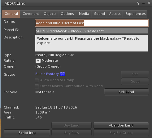
Firstly, just the ascetics bits.  You want people to see a nice name and description for the place, not something like “Parcel #59, 1024sqm, 512 prims” or something that the landlord has set to advertise the parcel.  So change your parcel’s name and description in the General tab.

I recommend that you set your land to group owned too.  This will allow you much finer control on what you and friends can do on your land, and what others can’t.  Even for a privately owned parcels like Aeon and I have here, it’s worth the L$100 group setup fee to do it.  To do this, click on the “Set” button next to “Group”, select the group you want to own the land, and hit the “Deed” button.  There is a full article about group owned land in the knowledge base that you should read before you do this.  And of course having said that, I now probably have to write a post about group roles and permissions 🙂

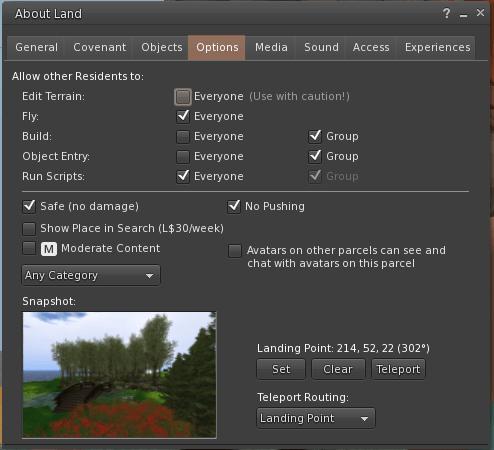
Next up, and most important, is what people can do on your land.  In the “Options” tab, you should untick “Build” and “Object Entry” for everyone.  If you don’t do this, you’re just leaving yourself at the mercy of griefers.  And unless you’re a combat sim, I’d also suggest you tick “Safe (no damage)” and “No Pushing” too.  Also, that “Use with caution!” line next to “Edit Terrain”?  It’s not a joke.  Make sure it’s unticked unless you are oh, let’s see, a sandbox who wants to teach people about terrain editing? 🙂

Do you want privacy?  In residential areas, mostly you do.  So make sure “Avatars on other parcels can see and chat with avatars on this parcel” is unchecked.

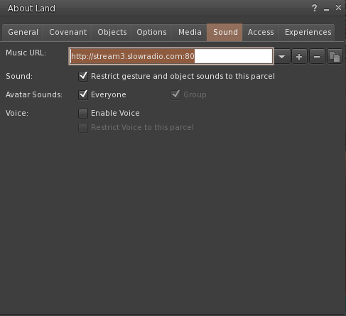
And lastly, everyone needs to get along with their neighbors.  The most irritating thing you can do in my opinion to upset your neighbors is let sounds, be they from gestures, radio, media like TVs playing youtube videos, or voice, bleed into surrounding parcels.

Tick “Restrict gesture and object sounds to this parcel”.  And if you enable voice, “Restrict Voice to this parcel”.  Please, please, please do this, your neighbors will thank you!

This post sprang from a friend of ours who devastatingly had her land reclaimed, was lucky enough to get it back before the landlord returned her objects, and wanted my help to set up again.


Jennifer

Or “How I got my shape right for my new Bento head” 🙂

I’ve been watching the revolution in Bento with keen interest.  Slink and Maitreya Bento enabled hands are fantastic (I have both), and some of the wings available?  Oh my!

Ever since Bento was released and offered us the opportunity to shape a mesh face how we wanted it, I’ve been keen to get one (to be honest, mainly so my eyelashes look right! lol)  Over the last few months, I must have tried twenty different demos from creators such as Catwa, Laq, AK, and GA.EG, but I couldn’t find one that I could shape so I would still look like myself.  My biggest problem was I couldn’t get my eyes right.

However, two weeks ago, GA.EG released a new model called Jennifer, and Aeon pointed it out to me as she has Barbara from the same creator, and saw the announcement.  Within 20 minutes of working with the demo, I had a very good feeling that this was going to be the one for me!

Working with the demos, most creators recommend you start with the included shape, so the first thing I did was copy their demo shape, and set every slider except the ones to do with the face to my measurements.

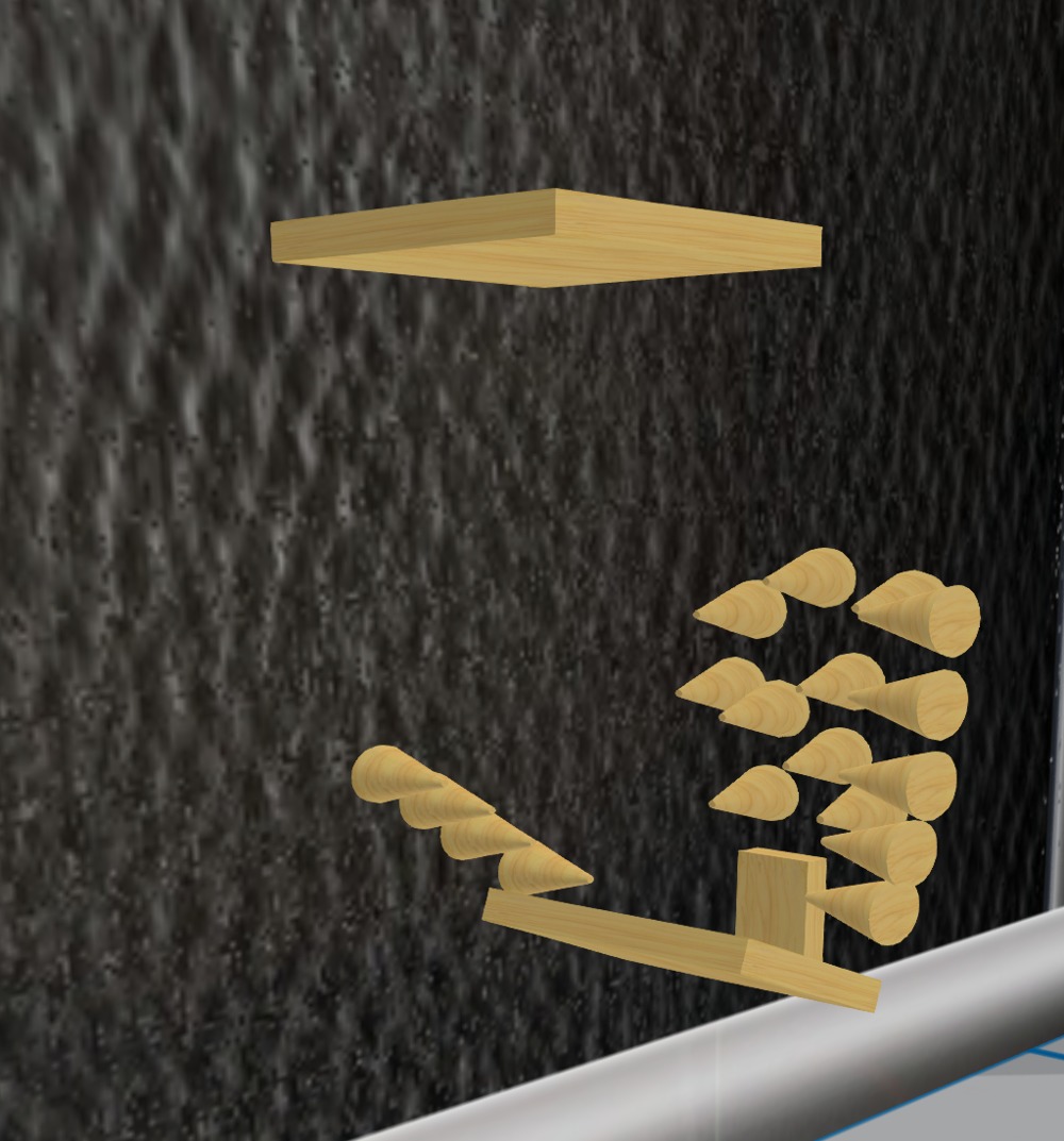
Then I created this evil looking device…

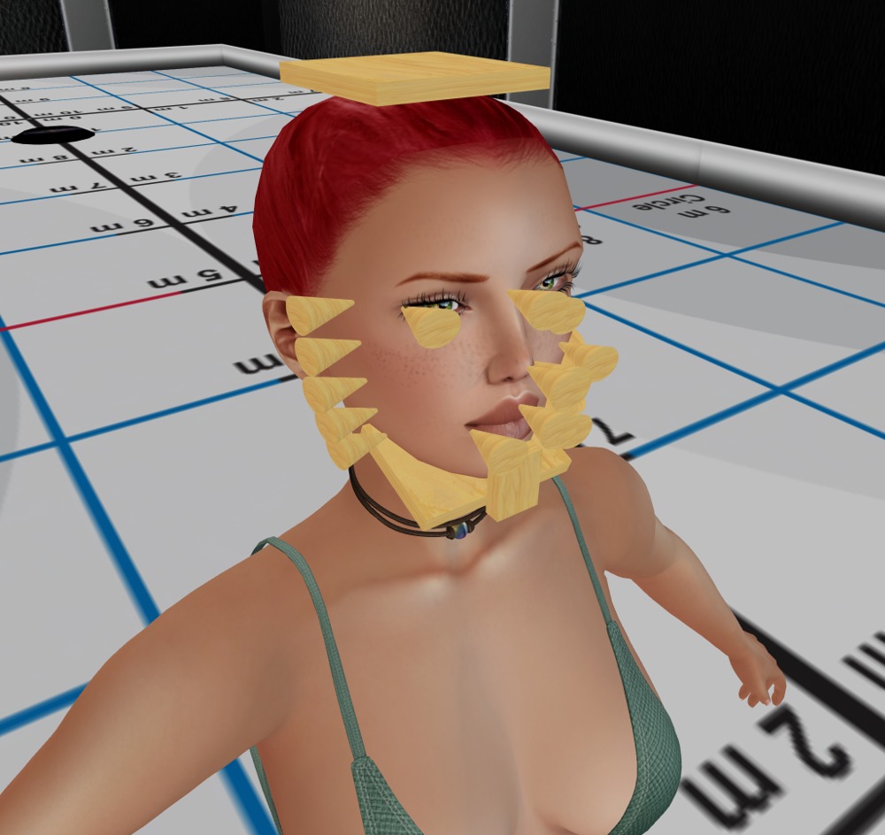
This is actually a pose stand (the base is out of the picture below).  While I posed on it in my normal system shape, I adjusted all the little cones so they would touch strategic parts of my face.  Then I changed to the mesh face and shape, and started playing.

Here’s a picture so you get the idea…

This turned out to be a huge time saver as I could look at a demo, pose on this, adjust some sliders, and know nearly instantly if the demo had any hope at all of matching my system face.  Not only that, it got me close enough to where I wanted things to be that I could then take a photo on a normal pose stand and without moving the camera, change to the demo. take another photo, and then do a comparison in Gimp.  I did comparison photos from both the front and the side.  Hundreds of them 🙂

While I’m still playing around a tiny bit, especially with the eyes and eyebrows, I got close enough with Jennifer that I pulled the trigger and bought it.  Here’s a before and after picture.  How do you think I did?

  • Bento Head: Jennifer by GA.EG
  • Shape: Blue’s Fantasy

Open Collar

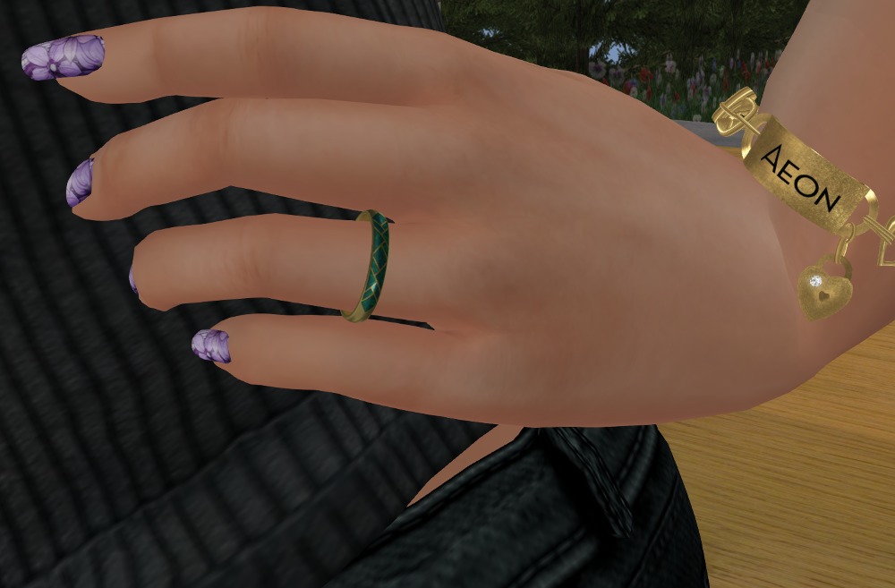
I put up a post a couple of days ago that linked to The Temple of the Collar.  Someone asked me if I used RLV because of the link, and yes, both Aeon and I use the Open Collar scripts, but not in the necklace I was wearing.  Rather, I took the script set and put it in our rings.

As Aeon made our rings, I had to understand how the scripts worked and how make an attachment to place the scripts in. This is a quick tutorial on how to do that with your own objects.

Firstly, you need to obtain the scripts.  They are available at The Temple of the Collar for free.  The object you get is a very plain collar called “OpenCollar Six”, and as you will see, it’s constructed exactly the same as what I will show you below.  Don’t panic!  There are quite a few scripts in there and you will have to use “edit linked” and move them to your inventory.

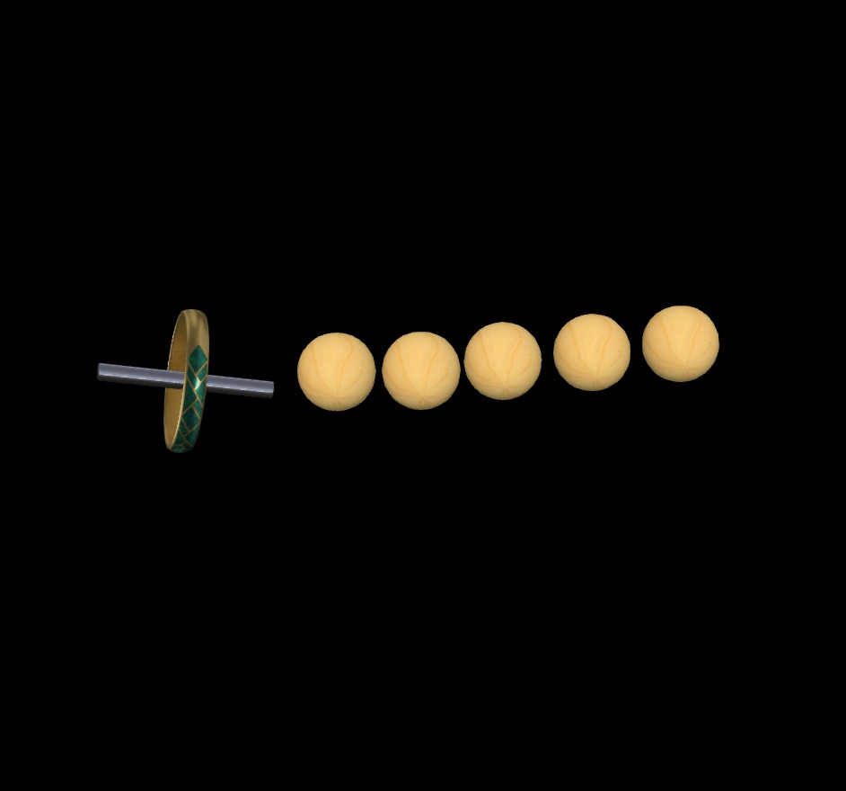
Next, you need to create a linkset with six prims.  For nearly everything you could wear, five spheres at their smallest size will do just nicely as we are going to make them transparent anyway (at least for the ring.  If you have an attachment with at least six linked parts, , that’s all you need, visible or not).

Here’s a photo with the ring and five sphere’s rezzed beside it…

Each of the spheres needs to be named in the edit window’s general tab.  The names must be exactly right for the scripts to work.

Name the spheres from left to right:

  • Settings
  • Animator
  • Authorizer
  • Dialog
  • RLV

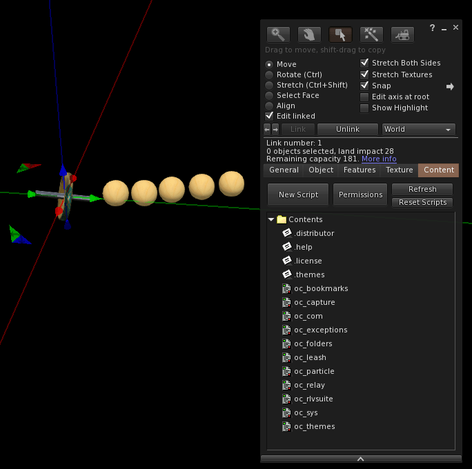
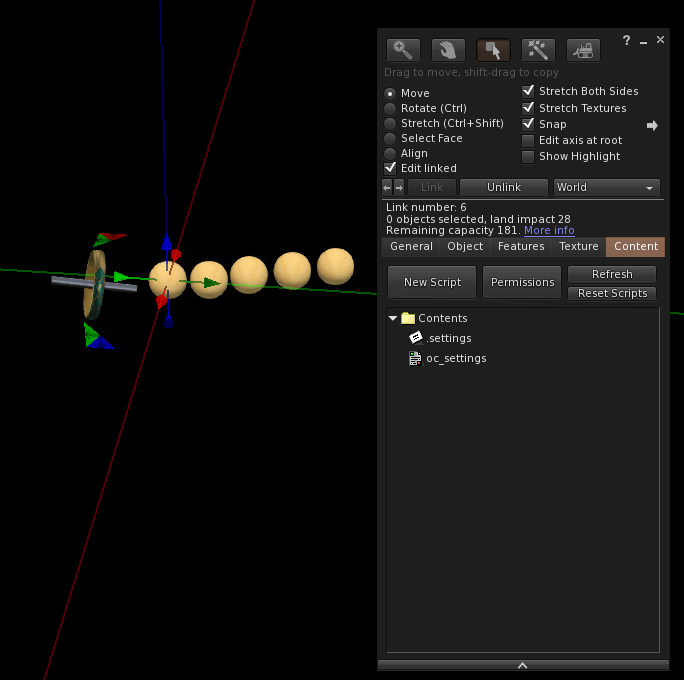
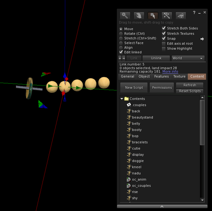
Now, from your inventory, you need to place scripts, notecards, and animations into each of the spheres, and the ring.

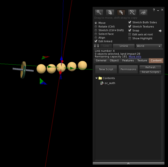
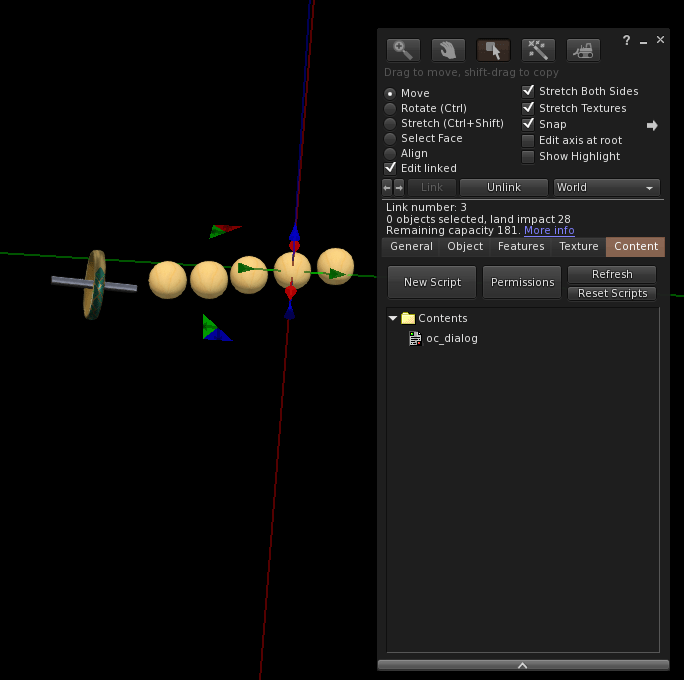
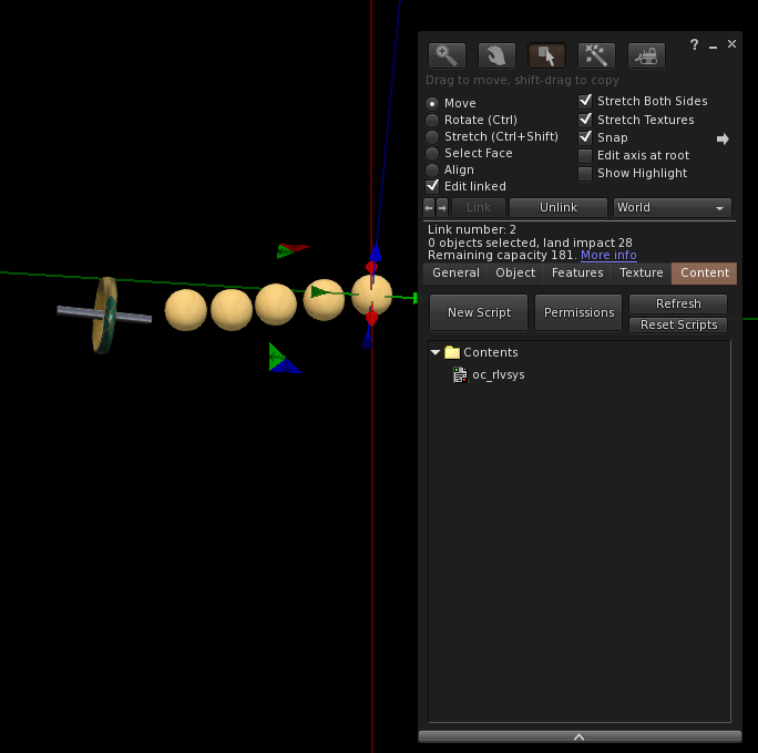
Here’s a photo for how each object’s contents should look, starting with the ring, and then followed by the spheres in the same order as above.  Note for the Animator, the contents are not all contained in the photo of the window.  Just drop the notecard and two scripts you can see in the photo, and all the animations from OpenCollar, into this sphere.

I can now link everything together.  Make sure you select the object with all the scripts (the ring, in my case) as the root of the linkset!  Reset the scripts in the object, and if everything has worked ok, you should get a message that says “RLV ready!”

Now you can position the spheres and make them transparent.  I just selected the root object (the ring), copied its position, and pasted the position into each of the linked spheres to position them all with the same center.

And that’s it!  Take the object into your inventory and wear for your personalized RLV enabled attachment!


Lighting

I mentioned in a previous post that I love playing with lights for photography in SL.  I use projector lights nearly exclusively, and in combination with the Windlight settings and the Advanced Lighting Model and a good graphics card, you can get some stunning effects.  I’ve barely scratched the surface of what’s possible, but I thought I’d give you a look at how to get some basic lighting setups going to make your photos more realistic.

If you don’t know how to create a projector light, there’s an article about shadows and setting up projector lights in the Second Life Knowledge Base.  Read it to find out about lots of settings and tricks.

Firstly, Windlight.  I find myself using “Nam’s Optimal Skin and Prim” and “Nam’s Beach Scene” when I want shadows cast from the sun, and “Narcon’s Natural Midnight” when I don’t.  I’ve used some interesting unnatural ones for special effects such as fog, and another for a red sky for a demon shot), but those three are the “go to” ones for natural looking photography in my opinion.

Next, a big secret that no one seems to mention is that you have the option of taking photos using a capture size much larger than your display.  You’ll find the width and height settings in the camera window.  If your video system can handle it and you have the memory in your computer, I recommend you set it to about two to three times larger than your physical display.  This is the same reason that RL photographers use large format cameras: the more detail you capture, the better it will look for scaled down pictures you’ll put on the web.  Also when you (ahem) digitally retouch a huge picture like this and scale it down, your retouches will be better hidden, and you reduce jagged edges too!  What’s not to like, as long as your system can support it?  My display is 1920×1080, and I regularly shoot at 4301×2303 or above.

Finally, if your graphics card can handle it, you should turn up anti-aliasing as far as you can to help eliminate jagged edges.

Note that turning on shadows and high anti-aliasing settings may significantly slow your frame rate, so do all this just before you press the shutter release (I use the new graphics presets for just this purpose).

Let’s look at a scene lit with “Nam’s Optimal Skin and Prim” with the talent (that’s me *grin*) facing into the sun and no shadows.

lights_001

Note that the Advanced Lighting Model is on (you can tell by the bump texture on the floor) but we have shadows set to “None”.  By the way, all these settings I’m mentioning are in the “Graphics->General” tab in Firestorm’s preferences (with the exception of anti-aliasing, which is in “Graphics->Hardware Settings”).

Now, lets look at a lighting setup to get something interesting happening here…

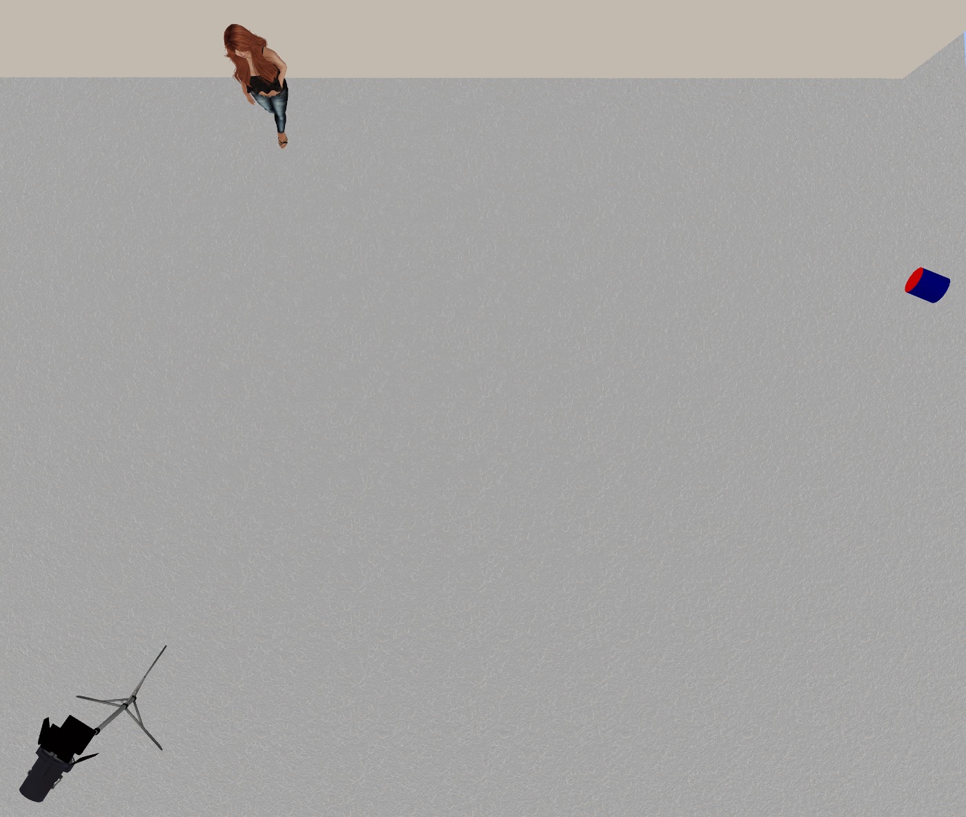
lights_002

Here is a top view of the scene.  The black light on the stand is my main light, and the blue and red cylinder on the right is my fill light.  I’ll talk about settings for both of these at the end.

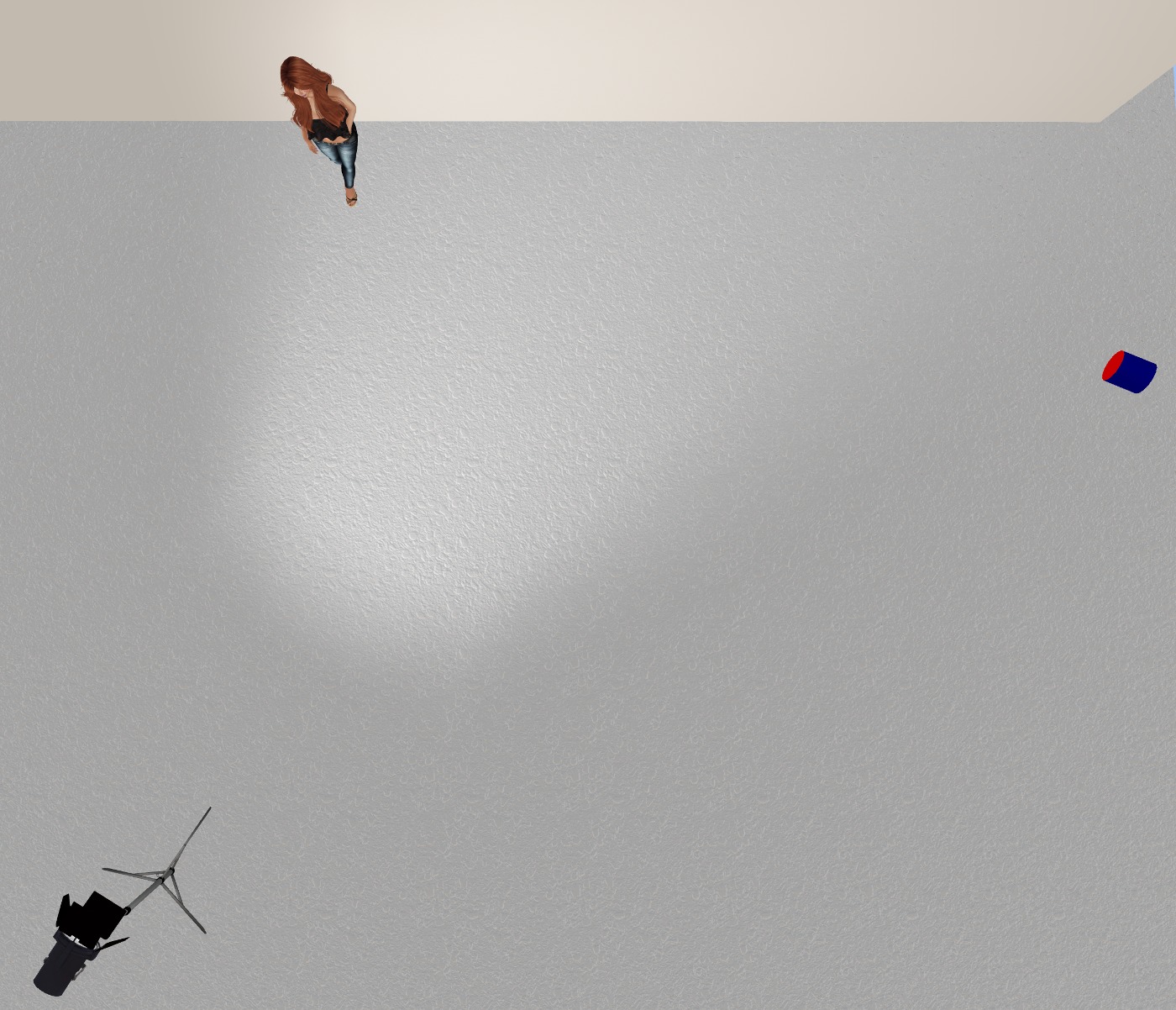
Lets switch on the main light which is just pure white…

lights_003

As you can see, projector lights are directional, so you have to think about positioning and rotating them to get what you want.  This lights my face and body, but I’m at the edge of the light, so directly to my right (the left of the picture) will be darker, and to my left will be lighter, gradually falling off as we get further away from the light.

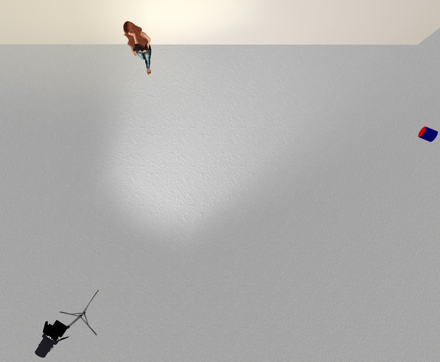
For the fill light, I am using a very light yellow that makes my skin look good and makes my hair highlight well.  Lets switch it on; it’s much more subtle than the main light…

lights_004

You can hopefully see the difference on the left side of the photo now.  We’ve considerably lightened it.

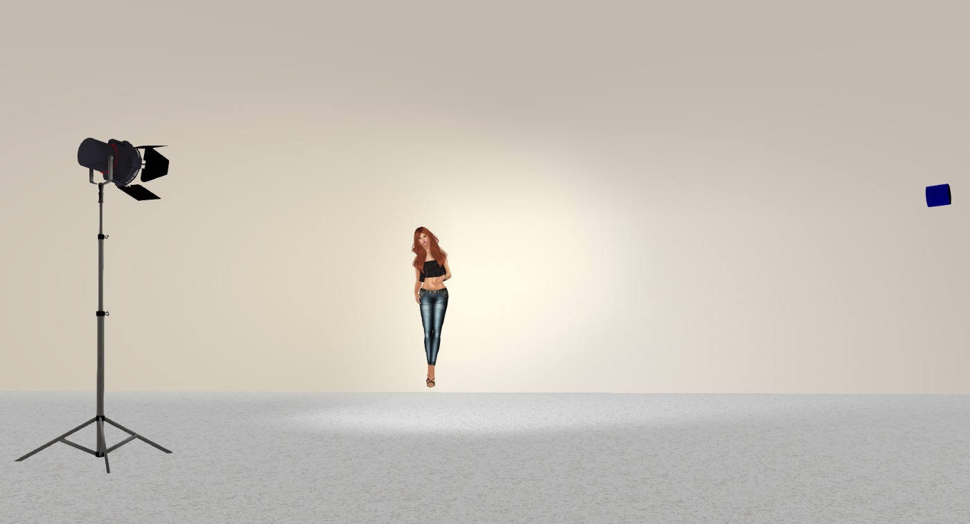
Here’s a front view:

lights_005

The fill light is much more noticeable from the front view, and you can see I have it hitting the wall well to the right and filling the left of the picture.

And finally, we can switch on shadows and see were we are.  Note you must switch on “Sun/Moon + Projectors”.

lights_006

Great!  Look at that!  We have three sets of shadows happening, the sun and the two projector lights.  The really heavy shadow is from the sun, the lighter shadow to its right is from our main light, and the faint shadow to the left of the picture is from the fill light.

Note the shadow from the body and stand of the main light to the left of the picture.  This is being caused by the sun.   You have to manage this.  You can do tricks like setting the object to 40% transparent or greater (then it won’t cast shadows at all) or you just reposition your camera or crop the raw image to manage unwanted shadows.  I left that shadow in deliberately so I could mention all that 🙂  Also, if I was shooting this to make it look good, I’d switch to midnight so I’d just have the two shadows from the lights and nothing from the sun.  You can see that effect in the photos I did for this outfit yesterday 🙂

Here are the settings for the two lights.  The main light first (I haven’t bothered showing color as it’s white) and then the fill light.

selection_002selection_001

I tend to use all six of the settings to control the lights (intensity, radius, falloff, field of view, focus, and ambience).  You can see they are very different between the two lights.  Possibly the one that you’ll play with the most is focus.  Negative numbers are soft focus, and positive numbers are sharp.  But play with all of the settings to find out what they do.

And finally, what works in RL works in SL (mostly).  Reading an article about fashion lighting on the web can significantly help you light your scenes better.

Remember, have fun!


Most of this is free

I was talking to someone today about this blog, and they said they loved it, and that Aeon and I are doing a wonderful job, but then they asked me from out of left field “How do you afford all the outfits?”  After getting over my surprise, I told them that most of the outfits you see here are all FREE (or very nearly so).

Of course, both Aeon and I have mesh bodies, feet, hands, and other pieces that cost us actual Linden Dollars, but a lot of the clothing, shoes, hair, and accessories are hunt gifts, Midnight Mania boards, Lucky Letter Boards, and group gifts.  It’s amazing just how much quality clothing you can get for a little bit of time investment plus a little bit of know-how about finding them.

So, I thought I’d do a post on just what to look for.

Hunts

This is a great way to spend some time and practice your camming skills 🙂  Someone will organize a hunt where you search for a specific item.  The organizer may be a single store and the hunt items are hidden about their store; or the organizer may be a professional organization, like Flair For Events, and the hunt items are hidden in a region, or even grid wide!

A lot of hunts are no cost (you buy the hunt item for L$0) and while there are some expensive hunts (where “expensive” may be L$15 an item), it’s rare to see hunts over L$5.

There are a few good websites that track ongoing and upcoming hunts.  Try these two for a start:

Here’s an example of a hunt that’s running now.  You will generally see a poster like this in participating stores:

WOH1 logo

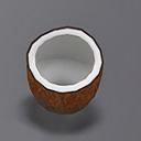
And also, they will generally show you the item that you are looking for.  In this case, it’s a coconut!

HuntObject

Some hunts (including the one above) require that you go and get a HUD and wear it while hunting.  The HUD will give you hints and landmarks to all the hunt locations.  Others will give you a notecard containing landmarks, and others will even have the next landmark included in the hunt item you just found!

Midnight Mania

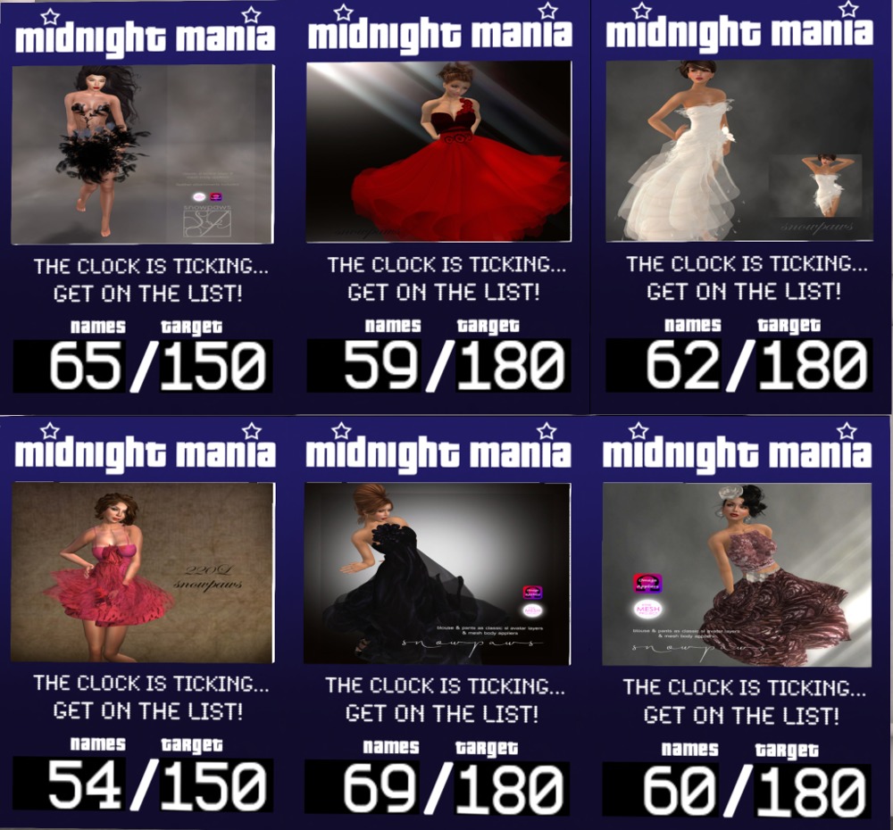
You’ve all probably seen these boards.  They are also known as “Night Prizes” or “Midnight Madness”.  The basic concept is the store owner will set a target, say 100.  If 100 avatars register for the prize in the 24 hours between one midnight and the next, all 100 avatars receive the prize.

midnight madness_001

Some boards require that you have the store’s group tag active, but a lot are “no group required”.

I watch the group chat for the “Second Life Frees & Offers” group where there are dozens of these announced every day.  If you don’t belong to this group, join now!

There is also a variation of MM boards called “Mini Mania”.  These boards generally have a low target, and when the target is reached (as opposed to at midnight) one avatar wins the prize.

Lucky Letter Boards

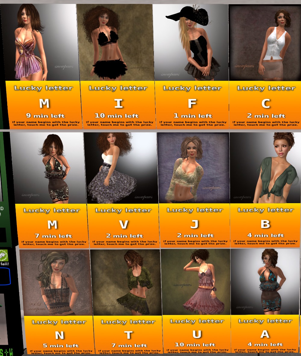
These boards usually have older clothing, and the idea here is that if the board shows the first letter of your avatar name (not your display name), you click the board to win the prize.  The letters change on a regular basis, set by the owner of the board, and the times can range from as little as a couple of minutes to hours.

lucky letter_001

Getting a group together for lucky letter boards is a good idea, because each time a prize is claimed, the letter changes.  With a group of people, you can all usually score some prizes for no cash outlay in a very short time.

Again, some boards require you have the store’s tag active.

Group Gifts

A lot of stores reward their group members with free group gifts.  There are a number of stores that are very regular about this and will have one every month (oh my, some people are wonderfully generous, and creative too).

The trick here is to find stores you like the items from, and join the group.  Some of the high quality clothing outfits (such as Ghee) require a one time payment to join the group, but the value here is that usually you can get all the past group gifts once you join.  Joining a quality group for L$250 and getting ten group gifts where the average price for an outfit at the store is L$250 is worth it, let me tell you!

Here’s a screen shot in the Firestorm viewer of a group profile, showing you exactly how to join up to a group.  You can usually find a group join terminal in the store, and clicking it will give you the link to open the group profile.

group join

Clicking on the “Join now!” button will join you up for no cost in this case.

Conclusion

That’s it really!  There are of course other ways to find free items (try going to the SL Marketplace and searching for “dress NOT demo NOT Demo NOT DEMO” and sorting by price low to high).  Use your imagination.  Keep your eyes open.  And most of all, have fun!


It’s a kind of magic

Solas from Blue Moon Enterprises offers a beautiful set of robes (for men and for women) with a wizard’s hat for the Medieval Fantasy Hunt XV!

wizard_c005

The hunt start is here, and there there is a Medieval Fantasy hunt group for discussion.

wizard_c002

The Wizard robe is slink fitmesh.  I had to alpha out arms, but that’s easy, and the result is gorgeous.  Did I mention I love purple?

wizard_c006

Okay, so what about the hat?  Hats are such a royal PITA in SL, but they’re not impossible – and some hats are worth the work.  If you’re comfortable – or willing – to try editing hair, you can make them work.  If you haven’t tried it, here are a few basic ideas for making hats work.

wizard_cHair

  1. Find hair that is small/tight to the head.  Depending on the look you’re going for – the type of hat – this might be sufficient.  I couldn’t get too small of a hair with this, I wanted something long.  Calico‘s ‘Katie 1’  (left) was exactly the style I needed/wanted to flow out from beneath the hat, but you can see in the centre image that the curls up top would not work with the hat. So,  time to edit!
  2. MAKE A COPY OF THE HAIR.  I tell you three times, and what I tell you three times is true: MAKE A COPY OF THE HAIR.  DON’T SKIP THIS STEP.
  3. DID YOU MAKE A COPY OF THE HAIR?
  4. If you’re using this hair for other things, then make sure you now use the copy, not the original.  If you can rename it, do so, otherwise throw this copy into the folder with the hat that you’re going to use it for.
  5. Wear both the hat and the hair, and go into a pose stand.
  6. I wanted to have both my bangs AND the tresses in back.  I resized the hair down as much as I could first — I didn’t need to worry too much about not having enough hair out the back (there was plenty), but I wanted to make sure I had my bangs in front.  So I resized down 10 percent or so, and adjusted the hair forward to make sure that the front looked good.  Now, WITHOUT the hat on, my scalp was showing on top of and in spots on the back of my head – but the hat will cover that well, and leave the hair flowing out from underneath the brim behind.
  7. Here’s where things get complicated.  right-click on the hair, and select ‘edit’ from the circle menu.  There is a little box next to the words ‘edit linked’.  Check this box.  DO NOT UNLINK THE HAIR!  You will need to start all over if you do, and you’ll make a gynormous mess.
  8. Select individual curls on top of the head.  If you can delete them outright, do so – I could not with the calico hair, but I could move them in and down.  That means there are a bunch of curls inside my head, but no one can see them.    This is a lengthy trial-and-error process, depending on the complexity of the hair.  For Katie 1, there are a bunch of static curls to move, plus some flexi pieces.  The flexi pieces aren’t sticking up too much, but be careful with these – these are the top ends of those tresses that we want to keep.  I just slide them down and slightly in until they disappear.  In effect, I’m just trying to drop them down the length of the tress, if that makes any sense.
  9. Back up your cam and look around your head a lot.  Check both sides – when you move a curl from one side in, it may shove out the other side!

And that’s really about it.  When you move around, flexi tresses may flutter beyond the brim – but I’m not too worried about that.  I can forgive a few sins during motion.  I think that it really can be worth the work to get a nice hat to work.

I hope that’s useful.  Good luck!  Oh!  Did I mention?  MAKE A COPY OF YOUR HAIR FIRST!  😀

This is a fantastic hunt, and not to be missed. Head over to the hunt start, and visit Blue Moon!  It is a kind of magic!

wizard_c2009

Mahalo, and aloha!


Tutorial – Making simple stockings

This is a quick lesson on how to make high stockings with one simple texture upload.

First, let’s create a texture.  I needed black stockings for my outfit so we will create a 256×256 pixel transparent image in The Gimp and bucket fill it with black at 40% opacity:

Create a New Image_006Workspace 1_007

Save this as a PNG file and then pay L$10 to upload it into Second Life.

In an appropriately named folder in your Second Life Inventory, create a new set of pants by right clicking in the folder, and selecting “New Clothes” and then “New Pants”.  A system layer pants object will appear which you can rename “Stockings”, and then wear.

Once you are wearing the pants, you need edit them by right clicking them in your inventory and selecting “Edit”, then click on the “Fabric” window, and add the texture we created above, save, and you are done…

Unless you are wearing Slink High feet like me, in which case you can use the same texture in Slink’s Personal Applier HUD to texture your feet correctly.